Every typeface is perceived differently – each conveying a set of character traits. These traits can include gender, personality, perceived value, and even an association with a particular business or industry sector. All typefaces are attached to a specific point in our cultural history and with these associations come customer expectations. Therefore, selecting the right typeface for your brand is essential to communicating the right personality, values, and tone of voice.
For example, rounded typefaces have a long association with children. Influenced through brands like Duplo and Lego.
Serif typefaces like Times are associated with history and are often used to project an image of heritage and stability.
Sans typefaces like Helvetica have strong associations with modernity and are most commonly used for tech brands like Google, Microsoft and Apple.
Here are some examples of how typefaces have been used to help support a particular story.
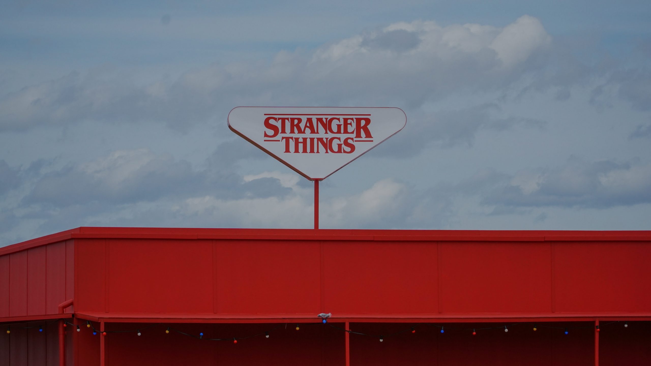
Stranger Things
The Netflix series Stranger Things ident used the retro inspired ‘Benguiat’ to firmly position the visual identity in the era the series was based, the 1980’s. The typeface also has strong associations with the book jacket designs of the horror genre. Combined, these give the right visual cues to the readers about what they can expect from the Netflix series.
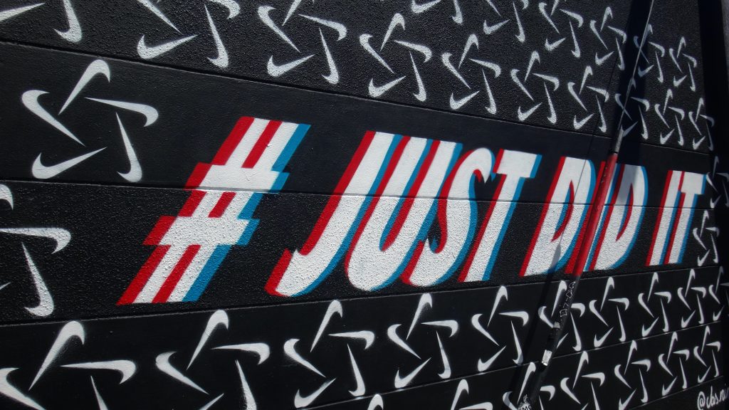
Nike
Sports brand Nike uses Futura, a bold and modern typeface. The bold weight suggesting strength is combined with italic suggesting dynamism and movement. Combined, they project a company with its sights set firmly on the future.
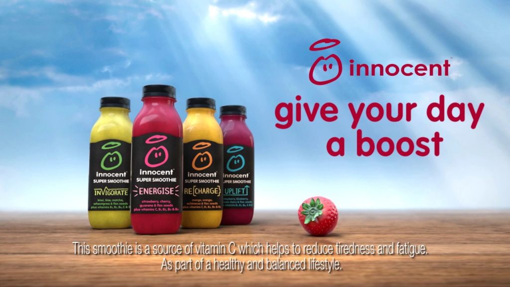
Innocent Drinks
Smoothie and juice company Innocent Drinks was founded by Richard Reed in 1998. They use VAG rounded, which has a friendly and approachable character. This choice of typeface helps to reinforce their childlike enthusiasm and adventurous attitude – fitting with the ‘innocent’ personality. VAG Rounded is paired with a conversational writing style that helped the company challenge the conventions of the juice market to become one of the most recognisable and successful brands in the market.
What typeface should I use?
First ask yourself the question “What are the characteristics you want your customers to associate with your company?” Now select typefaces that support these characteristics.
Think about how you use your typeface. The use of weight – light or bold – the use of uppercase or sentence case – all influence the tone of voice of your brand.
Take headlines for example, all upper-case headlines are associated with a more formal, authoritative, male character – and are associated with premium and luxury brands. Using all lowercase like Innocent Drinks, is associated with a softer more approachable character. These associations play an important part in customer reactions to the brand and in their decision-making when choosing who to buy from.
There have been several books published on the subject of type and their personalities. if you want to get under the skin of typefaces, two notable ones are:
Just my type? by Simon Garfield is a witty exploration into the stories behind famous typefaces and how they have helped shape and define the world we live in.
Marie Boulanger, an independent type designer and speaker is crowd-funding a new book ‘XX, XY : Sex, Letters and Stereotypes’ in which she investigates the relationship between letters and gender stereotypes.