The use of colour is an important aspect in differentiating your brand from competitors, defining your brand personality, attracting your target audiences, and for sending the right signals to help encourage them to buy your products or services.
Choice of a colour may often appear to be a purely subjective process as all of us tend to favour some colours over others and have different if not opposing reactions depending on personal associations or cultural differences. For example, in Western culture white is generally accepted as representing purity, elegance, peace and innocence whilst in some Eastern cultures it represents death, mourning or bad luck.
Having said that, there are a number of common aspects to colour that we are all subject to even before we tackle personal preferences or cultural differences.
Starting with the science – An experiment carried out in 1965 confirmed the belief that at the most basic level, the retina of the human eye contains three types of cones, corresponding roughly to red, green, and blue sensitive receptors. So whilst we are able to differentiate somewhere around 10 million different colours, RGB is the way colour has been recorded in all image capture devices dealing with the visible light spectrum, and how it is has been represented in all forms of displaying images from projectors and the cathode ray tubes of old to modern day led displays and smartphone screens.
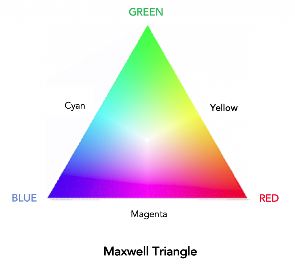
In 1861 James Maxwell presented his theory of three primary colours to the Royal Institution of Great Britain. The Maxwell Triangle as it is called, showed how all colours can be represented using light in the three RGB colours. Directly opposite each primary colour, in the mid-point where the other two primary colours overlap equally, Cyan, Magenta and Yellow are created.
All colour systems stem from this early understanding of how colour is perceived whether it be additive (projected coloured light) such as RGB and hexadecimal code or subtractive (colour printed or painted onto a surface) such as with CMYK (with black represented by K), Pantone®, or RAL.
Sticking with the science for just a moment longer, one aspect that may be important is to identify the colour that is most visible by the human eye.
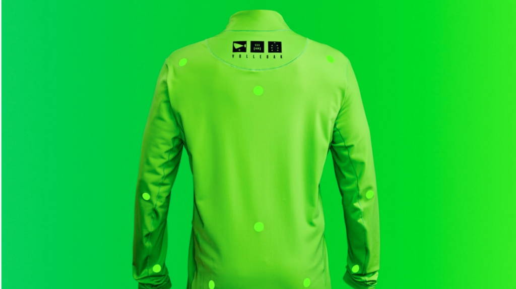
Vollebak, an outdoor sports retailer hacked the science behind human perception of colour to launch a new sportswear clothing item. After asking mountain rescue, members of the U.K. Special Forces, and people who work in some of the most remote and harshest places on the planet what they would want someone to be wearing in an ideal rescue situation, ease of visibility with the naked eye was a must have requirement.
Finding that orange was no longer the best way to stand out in urban traffic they looked at how the human eye responds to colour. According to the U.K. National Physics Laboratory, we are most sensitive to the 555 nanometer wavelength as this is the point at which the greatest number of cones in our eyes are stimulated the most. The colour at this wavelength is a bright green which Vollebak introduced on a new outdoor sport jacket claiming it to be the most visible colour ever.
However, as it isn’t possible to copyright or trademark a colour except under exceptional circumstances similar shades of green have appeared in branding before.
The Safety Supply company, a company that provides hi-viz safety clothing, use a similar shade of green in their logo and as an accent colour on their website.
Nike used a similar, albeit slightly more yellow colour, to stand out against the range of country flag colours used in athletes’ clothing during the 2012 London Olympics.
So what else do we need to know when choosing a brand colour or colours?
Colours illicit different physiological and emotional responses from us and over a long history of the use of colour in society, have come to represent a number of different things such as moods & emotions, values or status, events or special occasions.
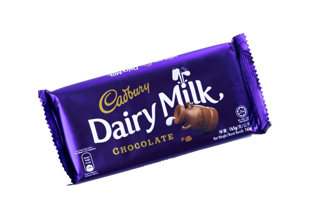
Social status for example was first linked to the rarity and cost of specific items or pigments used to create certain colours in the past. Gold and silver reflected the precious metals and colours like purple and red were very costly to come by. Both purple and red are still used in religious vestments and royal or baronial gowns and used to reflect special status (i.e red carpet occasions), special events (Christmas, red-letter days etc.), or premium quality items. Cadbury chocolate is an example of a brand linking the attributes associated to gold and purple to their brand and products. Less ‘cheap chocolate’ and more ‘guilty pleasure’, or ‘special treat’.
Whether or not we are fully aware of many of these emotional responses and associations, they have found their way into branding as a way of leveraging pre-existing associations or subconscious responses to colour to help define and position a brand, attract and engage the target audiences, and to generate sales.
Some of the more general colour responses and associations commonly used in branding include:
Red
Possibly because blood is red, it attracts our attention very quickly as it can indicate injury or danger. It heightens our awareness and has been shown to make our hearts beat faster and promote the release of adrenalin (fight or flight reaction or impulsive behaviour).
The fight or flight reaction can make us more compliant to commands or make us take quick impulsive decisions like an impulse purchase for instance.
Think stop lights, No-entry road signs, ‘buy-now’ buttons on websites and, retail ‘sale’, or ‘special offer’ signs.
Red (along with warm orange or yellow) is also associated with food, ostensibly from our earliest ability to spot ripened fruit and berries. Using red in a brand can subconsciously trigger a desire to eat. No surprise then that so many fast food outlets use red (often along with yellow or orange) in their branding to both attract attention, trigger an association with food and encourage a purchase.

Another aspect specific to the colour red, possibly due to our initial physiological reaction to potential danger, is that it can appear closer than other colours we see.
Many brands use red for this attention grabbing aspect alone to achieve standout in a crowded market. A good example of this is car hire firm Avis whose brand is often seen directly alongside competing brands.

Variations of shade or density of the red can be used to tone down some of the fight or flight response specific to the colour, and these variations when applied to any colour chosen for a brand identity can be used to convey aspects of youthfulness or maturity, approachability, authority, stability, or price and value.
Blue
The colour of sky and sea, blue is commonly associated with: Depth; wisdom; stability; loyalty, and health.
It is often used to symbolise trust, confidence, intelligence, honesty, and healthy.

Green
The colour most associated with nature, it is commonly associated with: Growth; harmony; Freshness; fertility. It also has associations with safety and money.
It is often used in branding to symbolise safety (in the case of medicines) or fresh produce.

Yellow
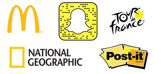
Yellow captures our attention more than other colours with the possible exception of the bright green discussed earlier and which is claimed to be the most visible colour ever. With one of its earliest associations derived from the natural world being one of danger or poison when seen alongside black, we are genetically programmed to take special note of anything that displays these two colours together.
Warning signage uses this combination to ensure we register danger and steer clear or follow instructions. Bright yellow is also said to be the most fatiguing colour for the eye as it reflects more light resulting in excessive stimulation of the eyes.
On the flip side of the negative associations of yellow with black, in nearly every culture yellow on its own is associated with sunshine, happiness and warmth. Some interesting cultural differences include Japan where yellow is often associated with courage, in Mexico where it is often associated with death, and in Russia where it has in the past been associated with madness.
Some of the attributes associated with the colour yellow include creativity, energy, optimism, intellect and hope.