Should brands animate their logos to capitalise on the opportunity that digital channels offer for attracting more attention, achieving higher levels of audience engagement, and conveying more of their brand personality or story?
The way a brand is represented by a symbol hasn’t fundamentally changed since Greek and Roman times. Generally, businesses still tend to be identified by a static logotype.
Originally this would just have been displayed outside the shop or business premises. A good example of how far back some of our logo traditions go is how ancient Romans signalled the location of someone qualified to cut hair by displaying a red-and-white pole. A symbol still used by many barbers today and probably the only one amongst modern day symbols that has had movement added to animate it.
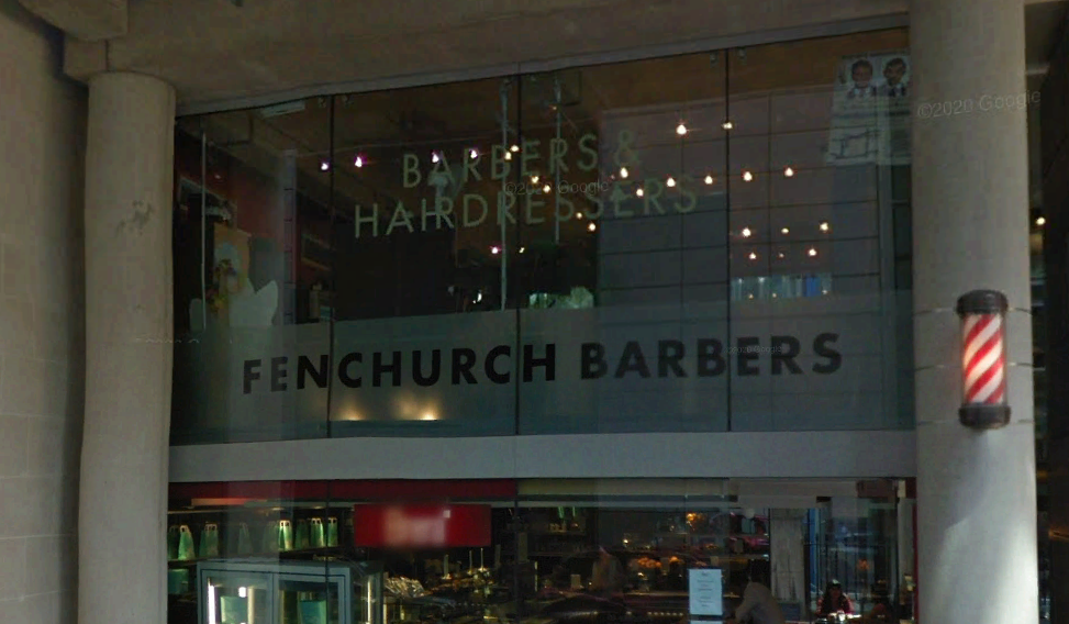
When print became affordable and accessible to the working classes in the 1800’s, businesses began using imagery within adverts for the first time and print became the primary if not only channel of communication available to most businesses as a means of reaching their target audiences. Static logotypes were appropriate for the medium.
Print was the favoured channel of communication for most businesses even after the advent of advertising on television as the cost of production and airtime was then, and remains now, a barrier for most businesses.
Print and Television weren’t really challenged until 30 years ago when the internet first went live in 1991. They remained the primary channels of communication until at least 2005 when YouTube was founded and video content could be streamed over the world wide web, Nike being the first major company to embrace it as a promotional platform in October of 2005.
This period, around 2005 – 2010 marked the time that print lost most ground to the internet as the primary channel of communication. However, thinking around how brands should be represented did not fundamentally change and the new generation of brand designers were generally still being taught graphic design and brand design with a bias towards the static logo.
Fast forward to today and there can be no doubt that the internet is now often the first point of contact with a brand and the primary channel of communication for all businesses. As a result of the Corona virus pandemic, consumers moved in their droves to purchasing online. E-commerce in the UK grew 4.5 times faster than before. Web browsing increased by 70%, TV viewing increased by 63% and social media engagement went up by 61%.
With 65% of people being visual learners, and 90% of the information transmitted to our brains being visual, we have to ask if brands are now behind the curve by not using motion graphics within their logos to connect with their audiences.
It has long been known that moving images attract and hold people’s attention better than a static image. If we look at the science, the human eye contains approximately 6 -7 million cones that register colour and 120 million rods that register movement.
It is therefore no surprise that moving images are more effective in gaining traction amongst audiences. Twitter has said that tweets with a GIF see 55% more engagement than those without[1].
Even though many brands create animated versions of their logotypes, generally they follow the approach set by the film studios of the 1920’s – 1950’s. Universal Studios, 20th Century fox and Warner Brothers all placed 3-dimensional versions of their static logotype within a 3-dimensional space and any movement was around the logo and not an intrinsic part of it.
[1] Weblink: https://twitter.com/TwitterBusiness/status/1070423034467540992
More recent film studio brands like Pixar Studios and Bad Robot have used animation or motion graphics to explain a facet of the character, values or nature of their company and as is to be expected, TV channel brands have kept abreast of these trends. Notable examples are Channel 4 and BBC 2.
Channel 4 has developed a series of short brand films to connect with audiences and convey a sense of the channel’s offbeat personality. Whilst BBC 2 continues to provide visually stunning displays of moving colour, form and texture based around the shape of the channel number.
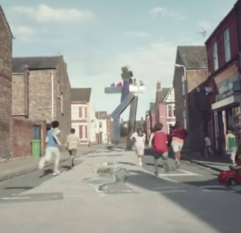
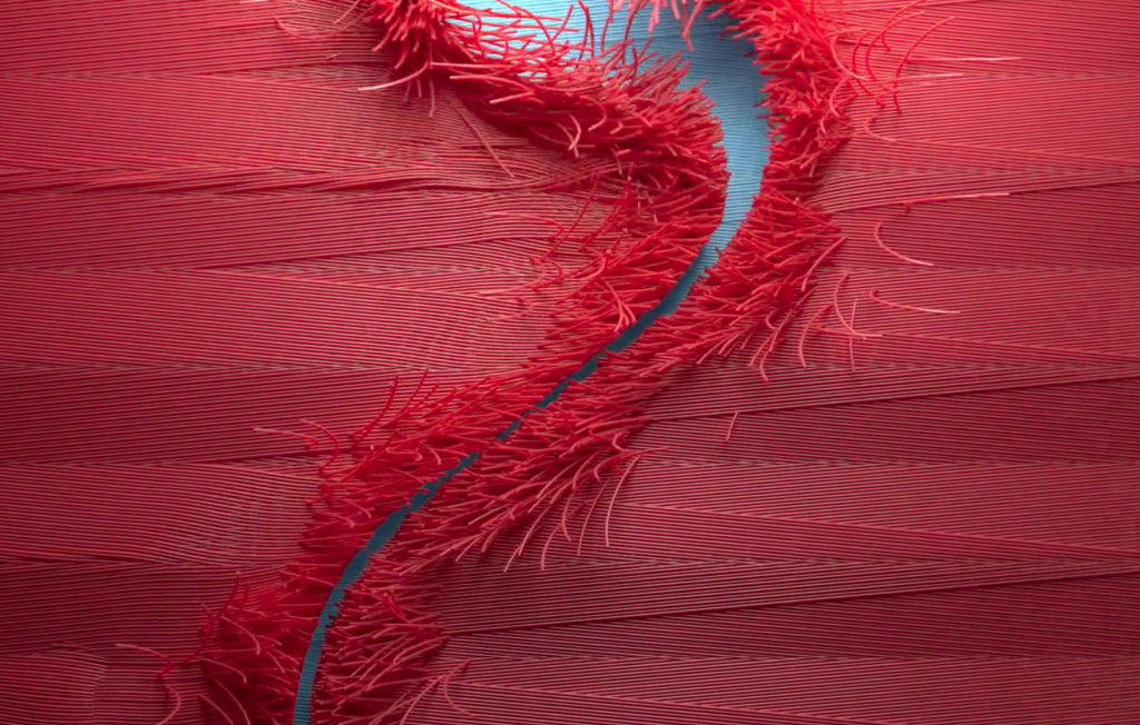
With very few exceptions, other brands have not kept up.
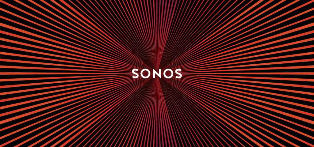
One brand that did for a short time is Sonos, a pioneer in wireless audio speakers and systems. They created a logotype that appeared to achieve movement without physically animating it. The logo designed in around 2015 by the Canadian company Bruce Mau Design exhibits a moiré effect, making sound waves appear as one scrolls the logo on a computer screen.
Airbnb, Uber, Instagram, TikTok and Spotify (to name but a few) are all brands built for digital platforms, using digital channels as the primary means of communicating with their audiences. And yet none of them appear to have added motion to their logotypes.

With the possible exception of TikTok and Spotify, it could be argued that as they are all static logotypes, they are stuck in a mindset suited more to printed media.
TikTok and Spotify at least reference movement or broadcasting in their static logos with the cyan and red stroke placed either side of the main symbol in the TikTok logo and a reference to sound waves contained within the Spotify logo..
So why should brands consider a moving or animated brand logotype?
- Digital channels are clearly now the first point of contact for the majority of audiences, no longer is it via the sign outside the shop or printed collateral.
- Movement and moving images attract and hold a viewer’s attention for longer than a static image does.
- It is far easier to convey the complex mix of messages and emotions that most brands attempt to deliver through a static logotype via a moving image or story.
- Recall of the brand and the brand essence or story amongst audiences is greater than that of a static image.
- At a time when many brand identities appear to be moving towards using the same or similar sans serif typeface for their logotypes, the differentiator in the minds of target audiences is likely to be the story and emotions associated to the brand, not the static logotype used to visually represent those aspects.


