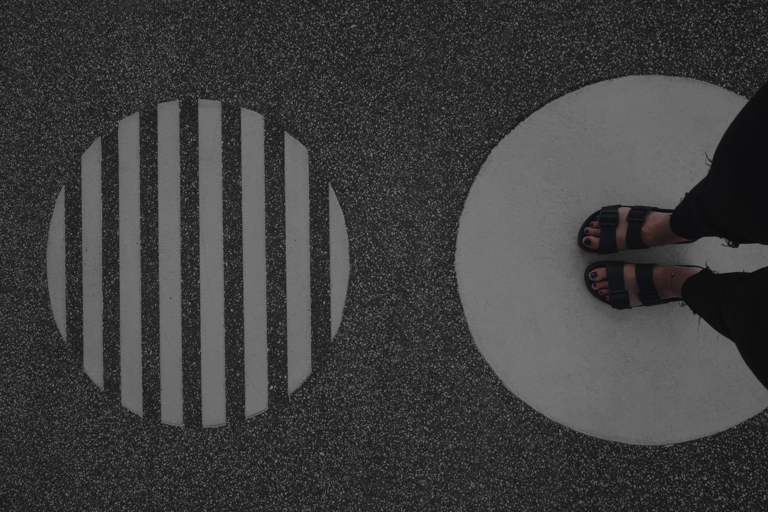
Our brains are hard-wired to remember distinct shapes and combinations of shapes. They play an important role as we grow up from toddlers to adults – from language and writing development to understanding how to navigate the world around us.
In the same way as using shapes to navigate from A to B, brands use shapes to provide signals to customers to come off the ‘highway’ to stop and ‘visit’ their brand. The stronger the association with a particular shape a brand has helps build a more memorable and distinct ‘road sign’.
Here are three examples of companies that use shape to build strong brands.
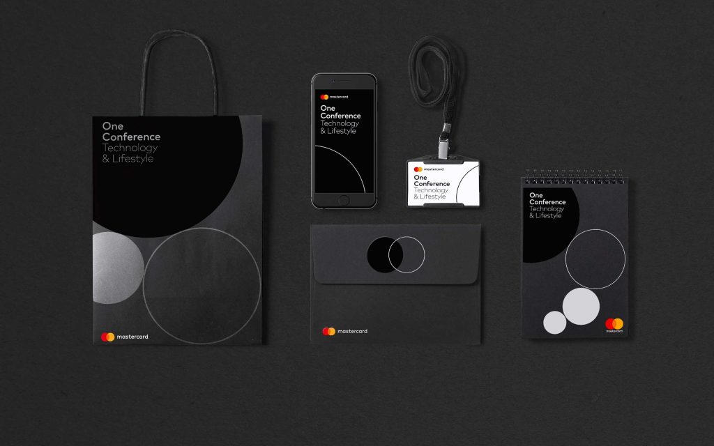
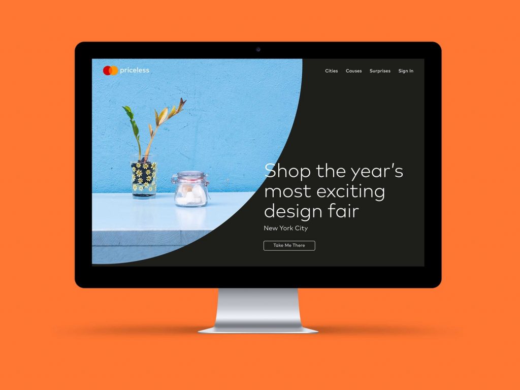
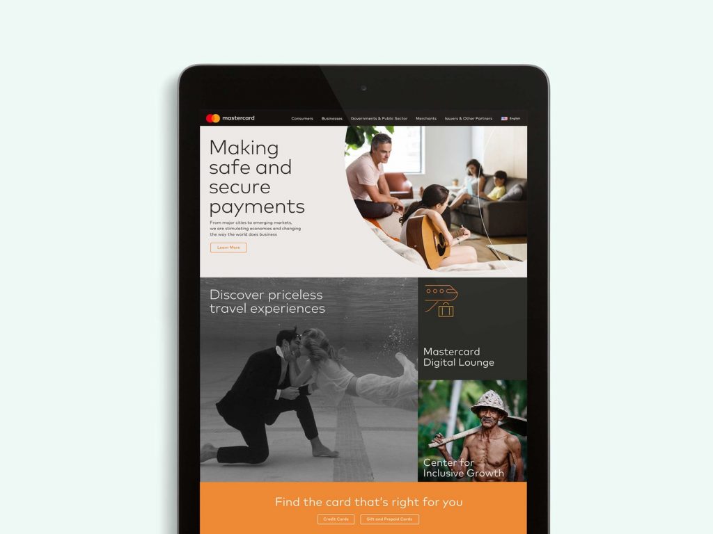
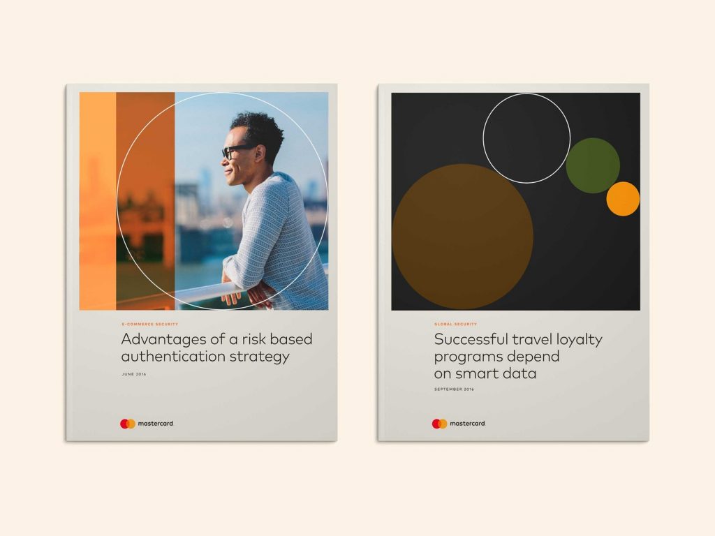
Circle – Mastercard
With its origin found in the Mastercard logo, the circle has become synonymous with the payment service who have become one of the world’s most recognised brands. The identity system builds on the circular form, using it in several ways. from a solid-coloured shape, an outline shape, a textural element over imagery, to a holding shape for imagery.
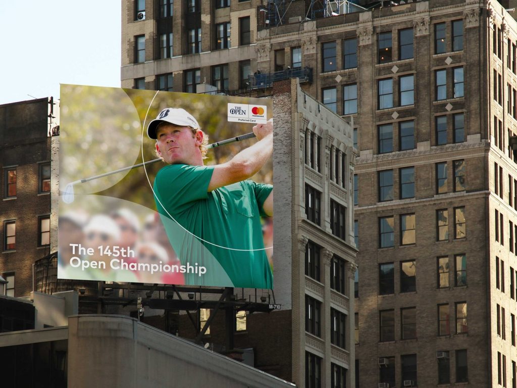
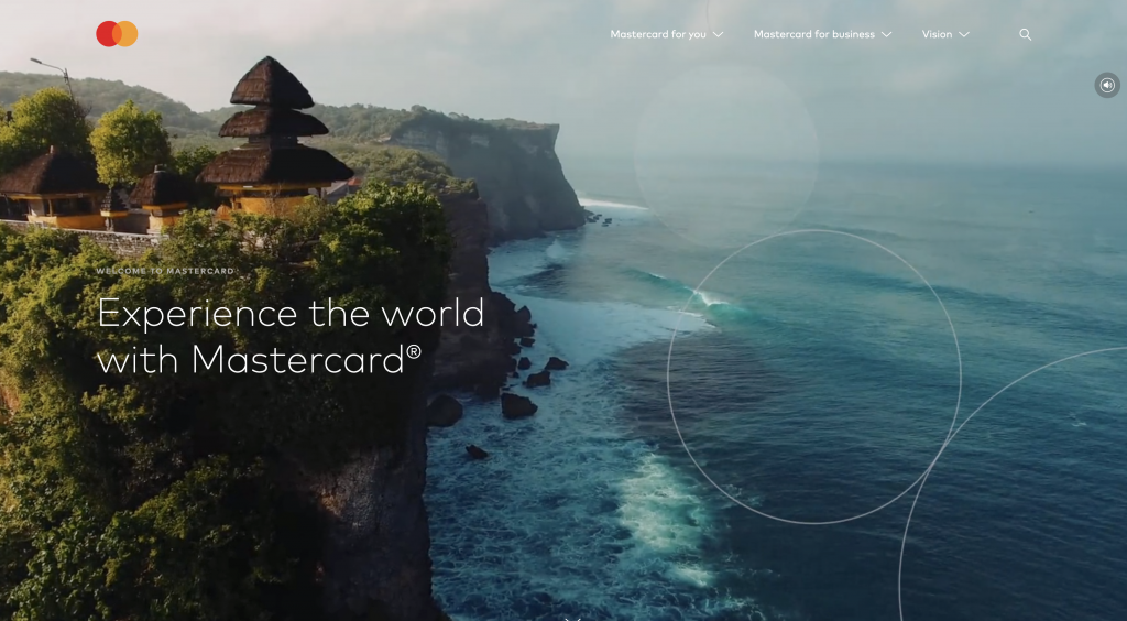
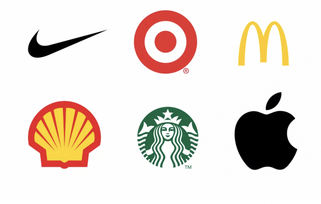
The ultimate test of brand recognition is also being put to the test, with the brand symbol being used on its own without the company name Mastercard – relying solely on the circle shapes to be recognised and understood by customers. This trend of dropping names from logos is being adopted by other brands too, including Nike, McDonald’s, Shell and Starbucks. It is a sign of confidence in the ability to be recognised purely by shape alone.
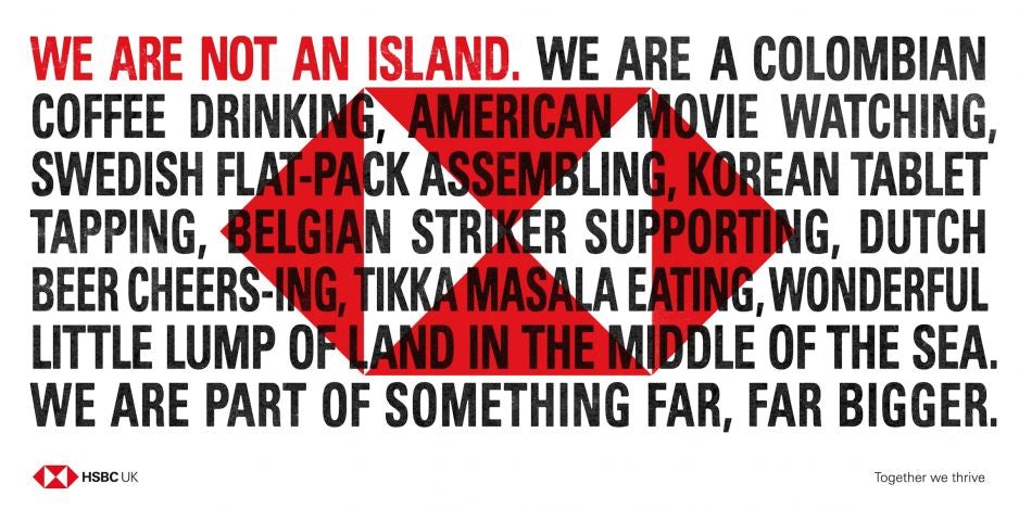
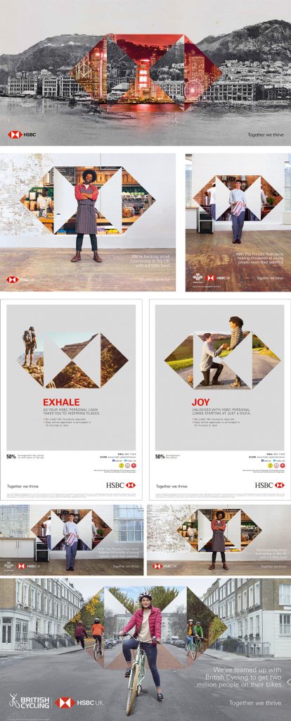
Triangle – HSBC
In 2018, HSBC faced branch closures, competition from challenger brands, and a 25% decline in brand value. As part of a re-positioning its hexagon logo made from four triangles was brought more front and centre in the visual identity, appearing as a prominent feature across all touch points, from advertising, website, app loading screens to social media. This brought cohesion to the global brand providing greater consistency for customers.
Designs used a combination of techniques using the four-triangle hexagon, from a bold red graphic used on their 2018 local markets campaign, to a creative window holding photography.
The re-positioning and more coherent design system paid off, with a brand valuation increasing by 15%, and a 16% increase in profits.
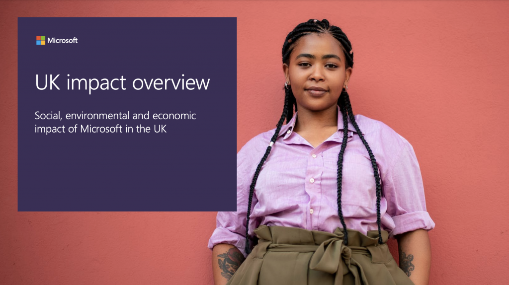
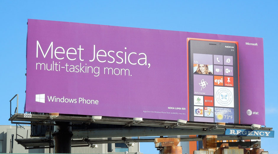
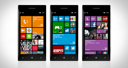
Square – Microsoft
The current brand, created in 2012 introduced a symbol made from four brightly coloured squares arranged into a window shape – an evolution of the existing Microsoft Windows sub brand, which itself has gone through 8 iterations from 1995 to 2015. Their purpose was to represent the company’s portfolio of products.
The square is then used across all brand touch points from website, brochures, and advertising. The humble square was also used as an integral and distinct part of the interface design for the Windows desktop and mobile devices – surviving 8, 9 and 10 generations.
What these three brands teach us is you can adopt a strong shape within your brand visual identity system without losing creativity and flexibility. And what you get in return is stronger visual coherence which makes you more unique, with stronger stand-out in the market, making your brand more memorable. And you will have a more protectable brand identity system.