Design delivers competitive advantage in so many ways: enabling smarter systems and processes, enhancing customer service, driving job creation, delivering efficiencies, improving profitability and much more.
Despite this, never before have brand marketers been under such intense scrutiny to justify every pound spent on design (or any marketing service, for that matter). The most persuasive way to communicate the value of your design investment is by measuring its true effectiveness – allowing you to powerfully articulate your case for budgets at boardroom level.
Global powerhouses like Diageo, GSK and Philips prioritise effective design to analyse commercial impact. But you don’t need to be a global brand to do the same. Set tangible objectives and benchmarks at the briefing stage, then measure results against those objectives.
These stories, taken from design effectiveness award winners, show that an investment in design is an investment in the future of a business or organisation.
Super 1s: Enhancing lives through sport
The Lord’s Taverners Disability Cricket Championships focus on cricket for young people with disabilities. Their mission is to provide opportunities to take part in regular sport at a grassroots level, to help young people improve their physical and mental wellbeing whilst making friends and engaging with positive role models.
In their award-winning work, Thinking Loud & Clear created a strong new name and visual identity to act as a platform that generates greater awareness amongst key audiences to ultimately support growth and funding objectives.
One-year after relaunch the results speak for themselves, with a 375% growth in regional hubs, a 159% rise in participants and a 60% increase in funding.
The previous name was a mouthful, the name and identity were no longer relatable by the programme’s key audiences, and they didn’t reflect the programme’s future aims and objectives.
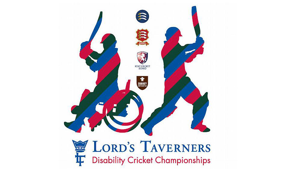
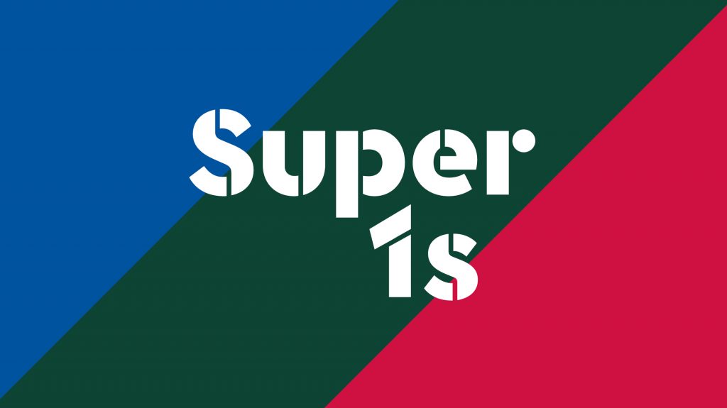
The new name Super 1s builds a strong link to Super 9s, the English Cricket Board’s county disability cricket programme, establishing Super 1s as the clear starting point for those who want to go on to play and compete at county level. Any notion of disability was left at the door. The identity is robust and distinctive in its own right, with a strong visual reference to parent brand Lord’s Taverners. It’s also much more than a logo – elevating Super 1s to become a ‘movement’, not just another grassroots disability cricket programme.
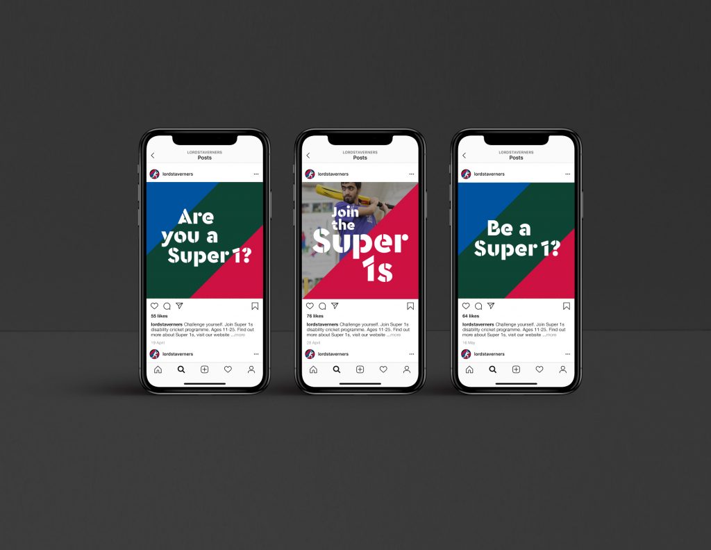

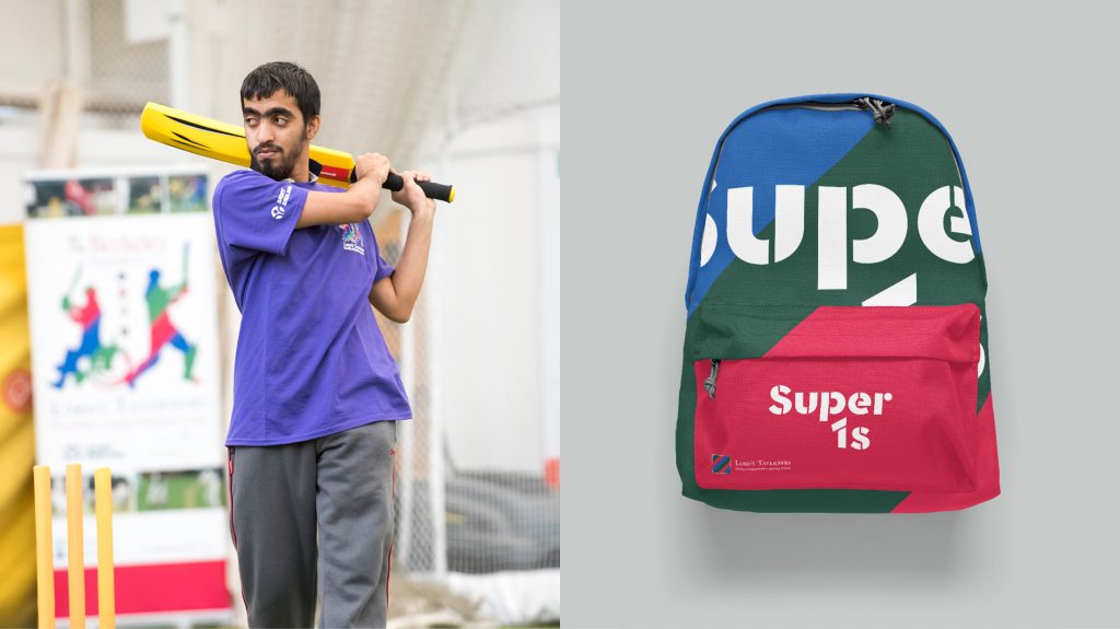
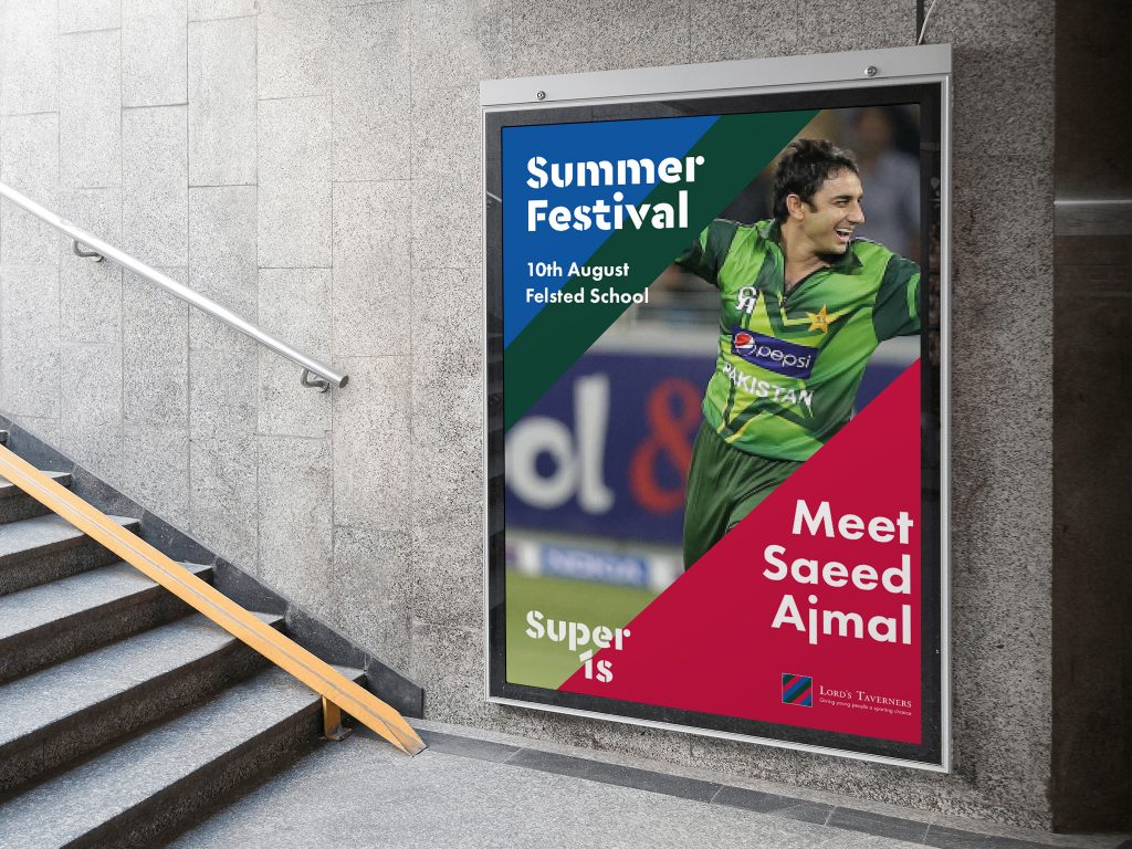
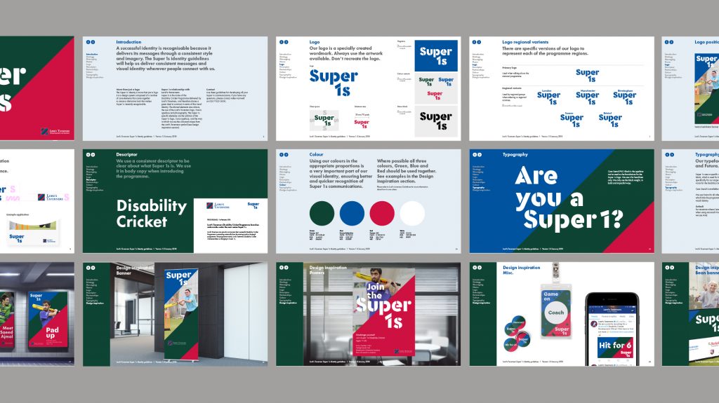
One-year after relaunch the results speak for themselves, with a 375% growth in regional hubs, a 159% rise in participants, a 60% increase in funding, and 80% of participants feeling more confident. Not only this, but they succeeded in their ultimate original objective – an official partnership with England Cricket Board, who now support Super 1s as the grassroots disability cricket programme.
Glengoyne Distillery: Improving the visitor experience
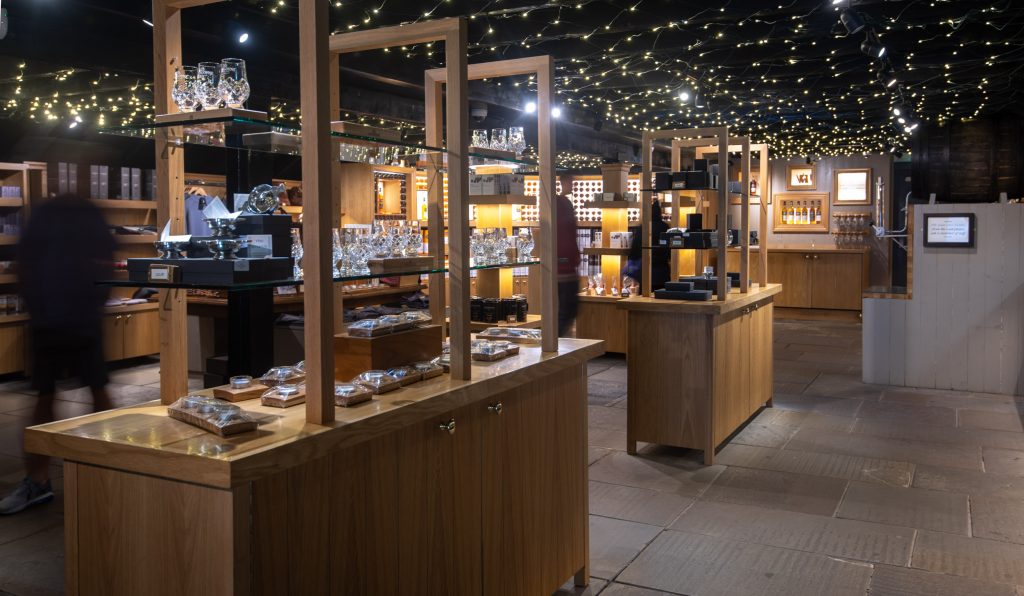
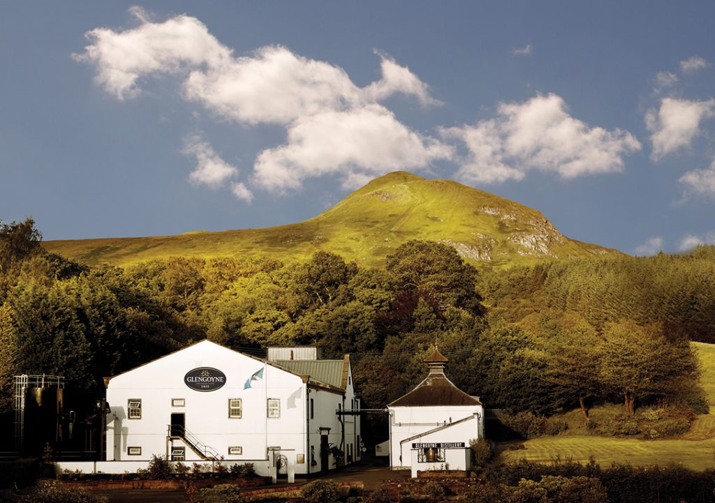
Over the course of a decade, a design programme enabled a distillery in Scotland to effectively leverage the commercial potential of its site and deliver a premium brand experience through visitor tours.
Glengoyne had offered tours for many years, but with a small, unextendible footprint and a working distillery onsite, the experience for visitors and staff was cumbersome. To enhance visitor flow, the tour process was reviewed in 2008 and the success of that design investment and collaboration with Contagious led onto a more expansive programme.
Visitor numbers soared 117% and spend per head jumped 79%, plus Glengoyne’s rise in visitor numbers is over double the national rise of 56% since 2010.

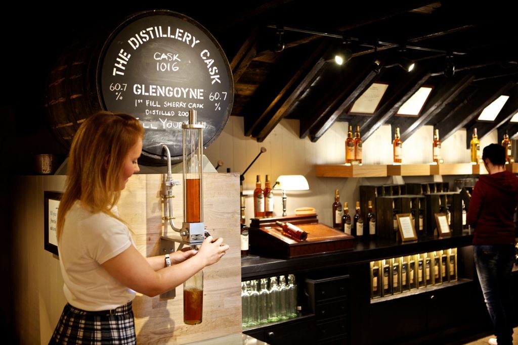
Developed and implemented incrementally across a ten-year period, with the briefs for each stage rooted in the tangible results of preceding phases, a design focus on quality, pace and flow enhanced the entire visitor experience.
Visitor numbers soared 117% and spend per head jumped 79%, plus Glengoyne’s rise in visitor numbers is over double the national rise of 56% since 2010.

Schwartz: Inspiring kitchen partner
Cultural interest in food has sky-rocketed, but Schwartz’ herbs, spices and seasonings were experiencing a decline in market penetration. Despite being a key category player, it was perceived as old-fashioned and struggled to find relevancy with some demographics.
Collaborating with BrandOpus and Marks, a new positioning, identity and jar structure moved the brand from ‘functional kitchen tool’ to ‘inspiring kitchen partner’ to justify the brand’s price premium. With consumers re-appraising Schwartz, penetration rose by 1.2 points, to 25% of the UK market.
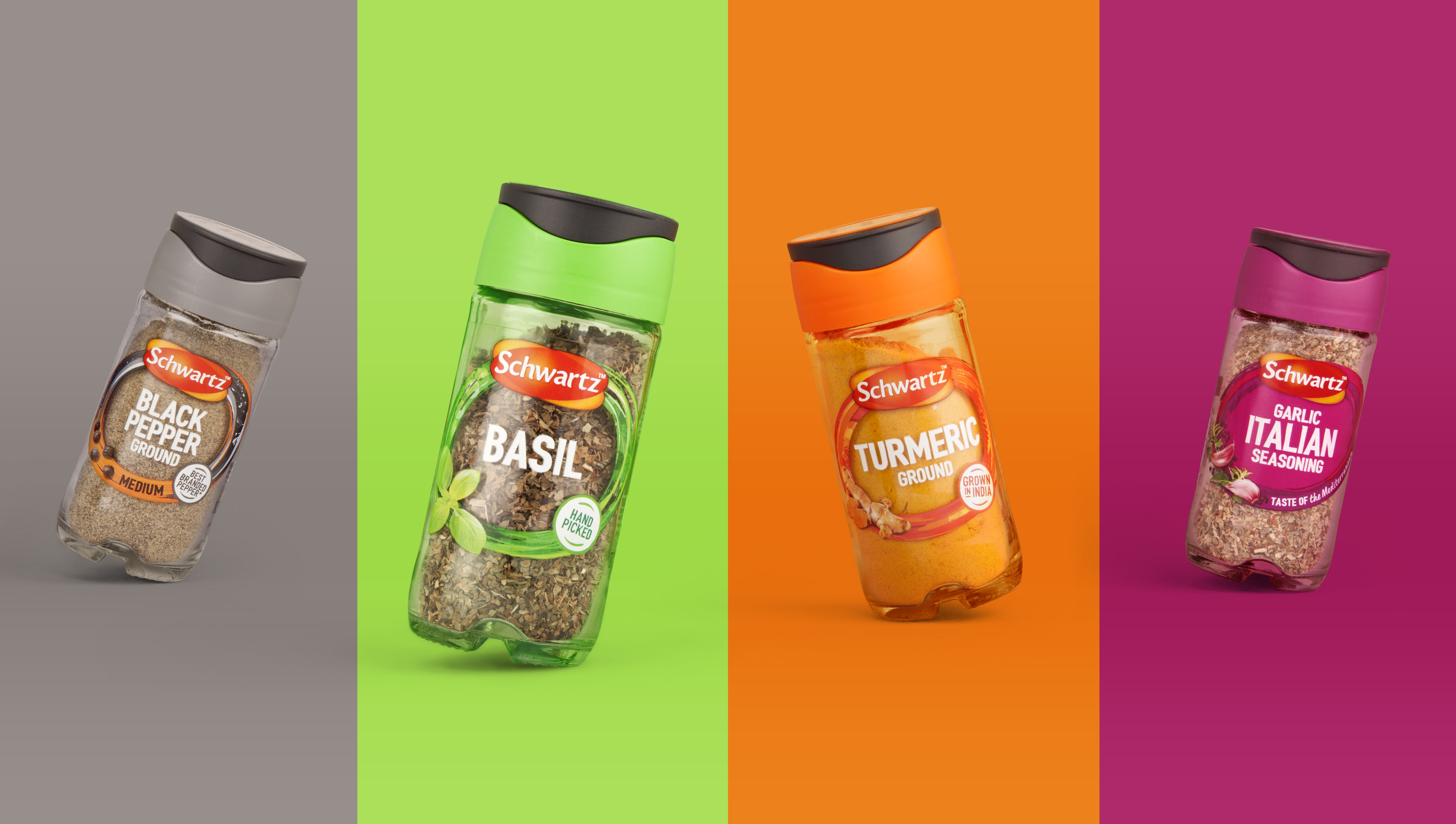
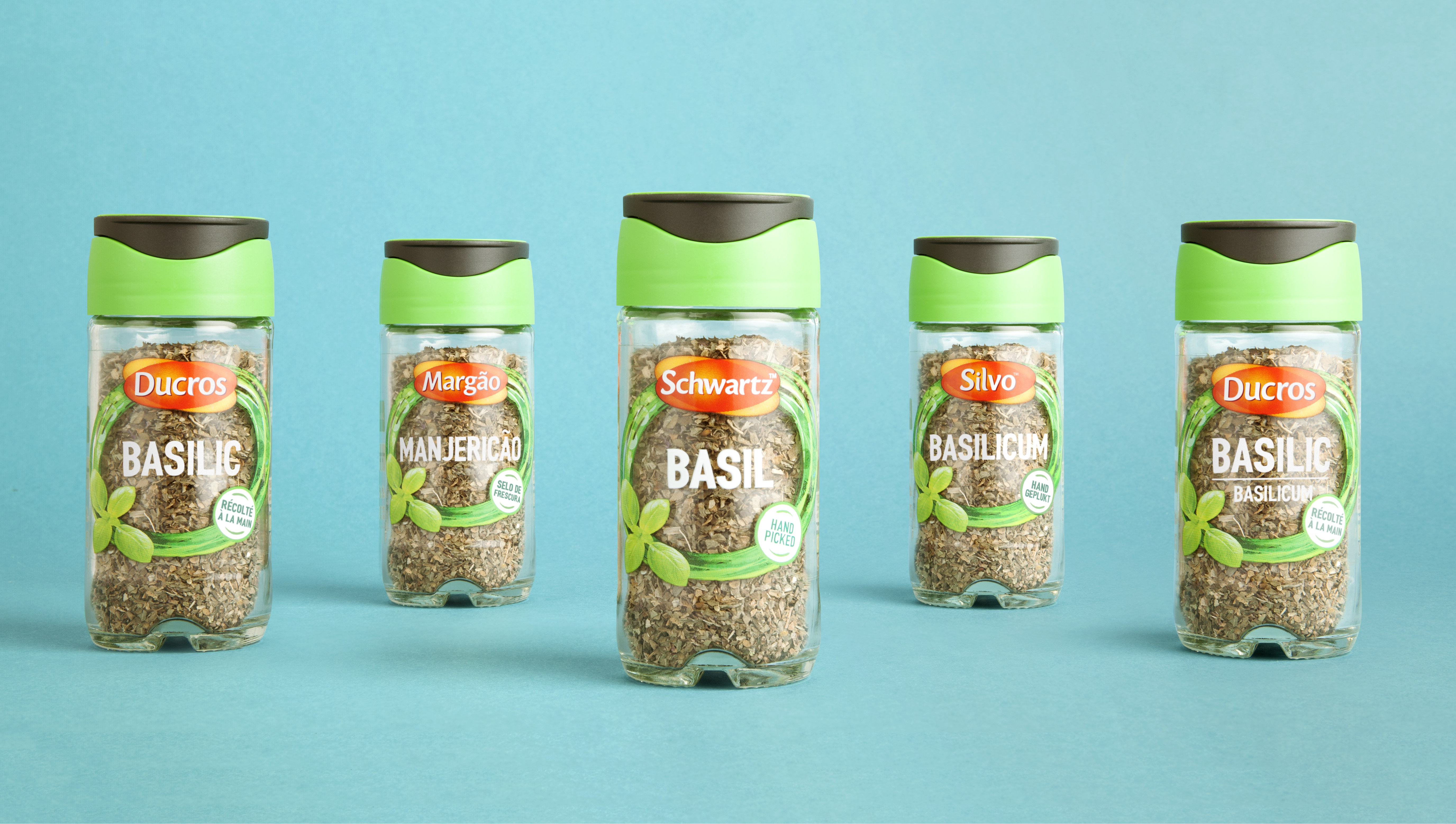
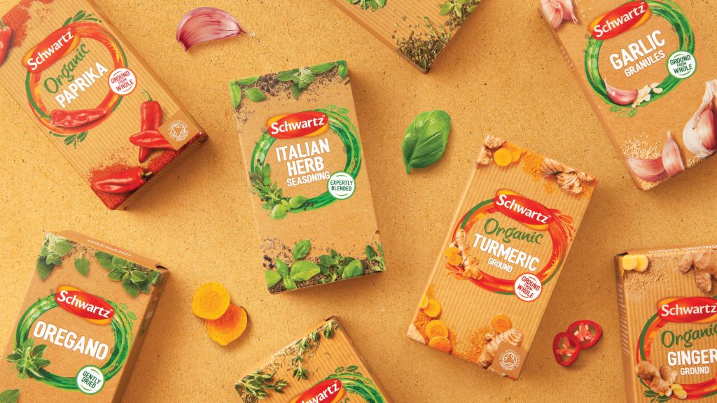
Regaining loyalty, Schwartz grew its jars by 2.8% in value following redesign, increasing share by 0.1 percentage points to 32.6%.
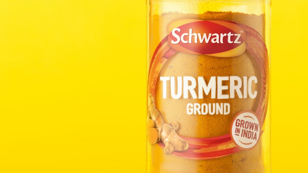
Regaining loyalty, Schwartz grew its jars by 2.8% in value following redesign, increasing share by 0.1 percentage points to 32.6%. Crucially the identity and positioning have allowed for innovation – its new Street Food seasonings unlocked penetration with ‘pre-families’ where Schwartz previously under-traded, reaching 325,000 new households, 90% of which were incremental to the brand.
Results driven. Work that works. Measurable effectiveness. That’s the definition of great design. Anything else is almost certainly wasted money – lipstick on a gorilla.


